Komala hatchery’s Nandu’s Chicken is a brand that primarily sells meat and seafood products. A Bengaluru based brand has a sixty-year legacy in this sector. The brand has a vast range of products which includes raw meat and ready to cook products.
Nandu’s Chicken wanted to reach every consumer with its vast range of products. So, the brand entered the retail sector and aimed to be the top player in the Bengaluru market.
With the new market and competitors in this sector, it became crucial for the brand to re-think its strategy to associate the brand with the audience.
The brand was new in the retail sector and surrounded by established brands. The brand had a vast range of products but had a lack of digital presence and technology. The brand wanted to form a relevant connection with the audience and form itself digitally.
The meat and seafood industry is affected by adultery. The local vendors use chemicals for preservation that are harmful and unhygienic.
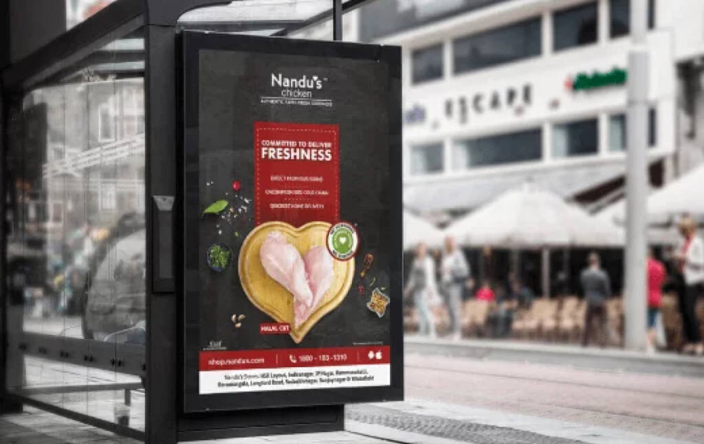
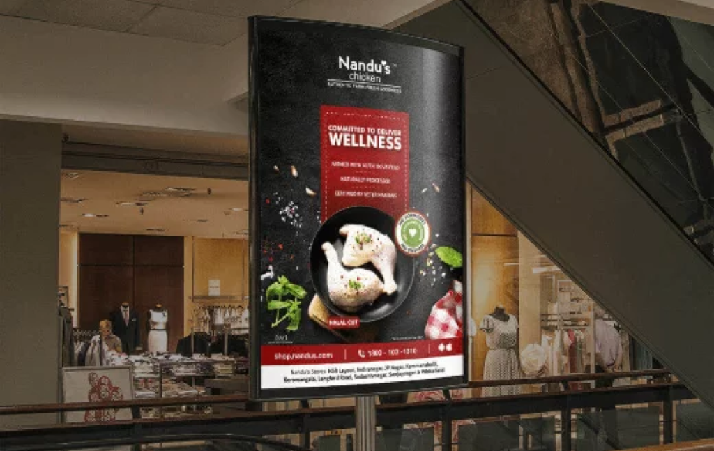
Nandu’s chicken is a brand that believed in giving the best of chicken to its consumer. A chicken without any Hormone and Steroids. The campaign idea brought us to ‘Committed to Deliver.
So we positioned the brand as the healthiest chicken in Bangalore.
We aimed to create awareness about the campaign through digital mediums to connect millennials and the rest with compelling print ads. In addition, our digital films also helped the brand to spread awareness about healthy chicken.
The campaign Committed to Deliver increased retail stores from 4 to 20, and the E-commerce sales increased from 75k to 7 lakhs in just 6-months.
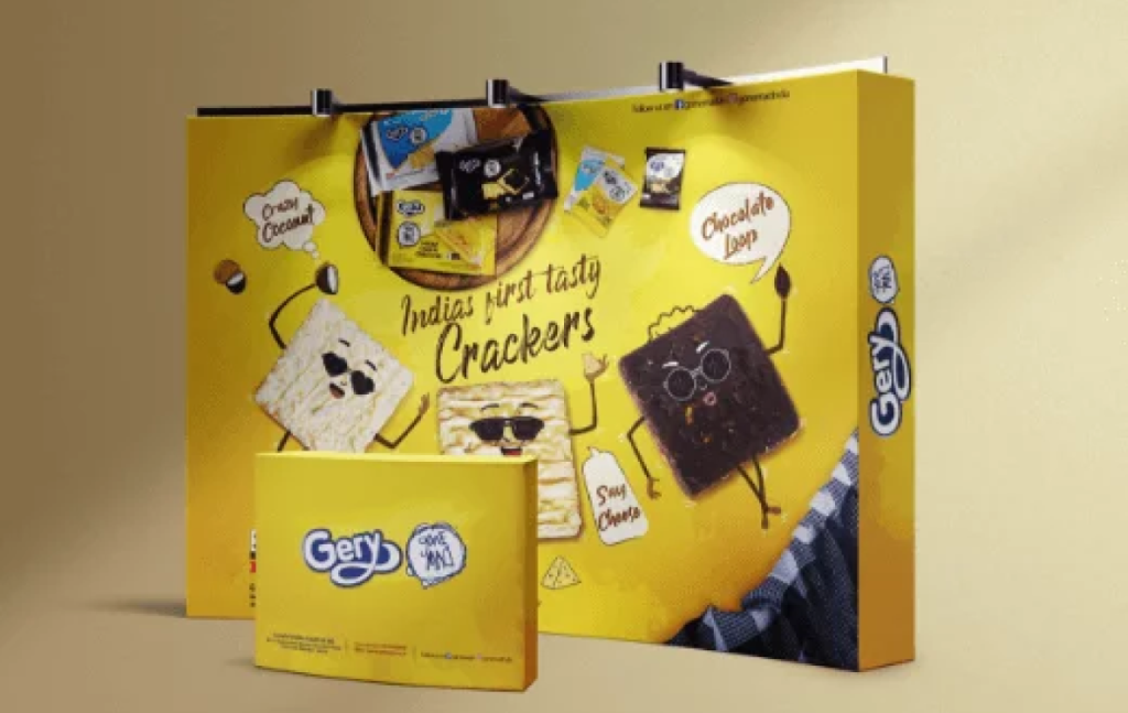
Gery Gone mad has become the ubiquitous snack product served at every home. The brand has a comprehensive and unique range of products with a strong distribution network across India.
Garuda Polyflex Foods Pvt. Ltd is a joint venture established in 2011 between Garuda Food of Indonesia and the Polyflex Group of India.
Polyflex is a 40-year-old Bangalore Based $50 Million Company that deals in the Luxury and Comfort business.
In the vast pool of the growing FMCG market, the brand Gery gone mad wanted to create a buzz in the South Indian market and to stand out as a brand in the region.
The consumer has always preferred Gery gone mad for making their snack break delicious with Choco stick, Sugar Cheese Cracker and other gone mad products.
The brands’ objective was to make Gery gone mad more relevant for the millennials and register strong brand awareness. Hence the digital medium is used to connect with the audience.
The Gery gone mad products received good reviews, but the brand awareness was too low compared to its competitors. Hence the brand wanted to reach its target audience and form a community.
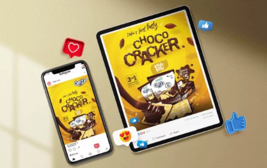
‘Cash prize’ has been a trend to grab the attention of the Millenials in 2020. So the brand launched a consumer promotion campaign called ‘Cracker ko cash karo’. The idea was to provide a value-add to the consumer. So on every pack of Gery gone mad Sugar cheese crackers, the consumer will get an assured cashback of ₹100 and a chance to win a cash prize of ₹50,000.
The brand positioning was a youth brand, and the communication crafted was quirky and engaging to grab the audience.
We aimed to create awareness about the product through the campaign. The brand collaborated with influencers to share and amplify the message to reach the target audience. The brand also made an animated digital film and digital ads to create buzz on social media.
The brand business improved in the south Indian region, and it received 10 lakh Sugar cheese cracker sales.
2 Mn interactions on social media
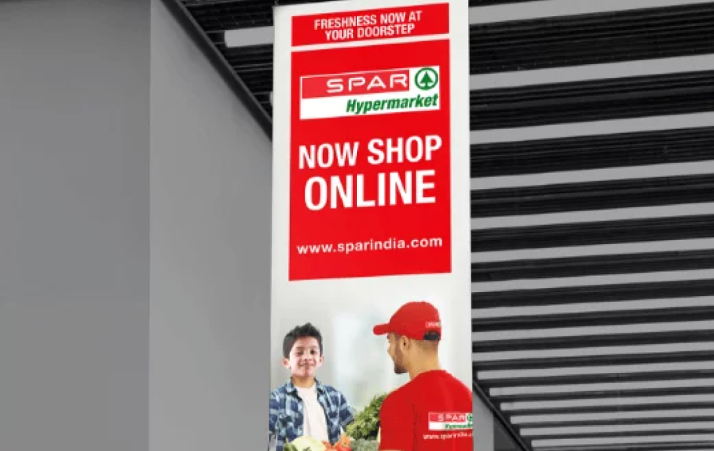
Spar Hypermarkets in India result from a strategic partnership between Dubai based Landmark groups Max Hypermarkets India Pvt. Ltd. & Amsterdam established SPAR International. The company started with one store in 1932 and now comprises 12,500+ stores in 44 countries across four continents. At the heart of these core values is SPAR stores’ commitment towards Freshness, Choice, Value, & Service.
The Spar hypermarket wanted to launch its online store and create brand awareness.
The brand wanted to build traffic to the website and create awareness of sparindia.com. As the few segments of the crowd still believe in buying groceries offline. It was a challenge to compete with Big brands other local stores.
We used the heritage and brand value of the original brand and targeted the existing consumers to establish the new channel. So we choose both print and digital mediums to promote and reach the brands’ target audience.
The print ads helped create hype about the channel, and the digital post helped reach more people.
The integrated campaign Now Shop Online helped the brand to generate business and reach across the city. In contrast, within 6-months, the brands reach had an increase of more than 10 lakh.